

 See My Latest Article on HelloNation
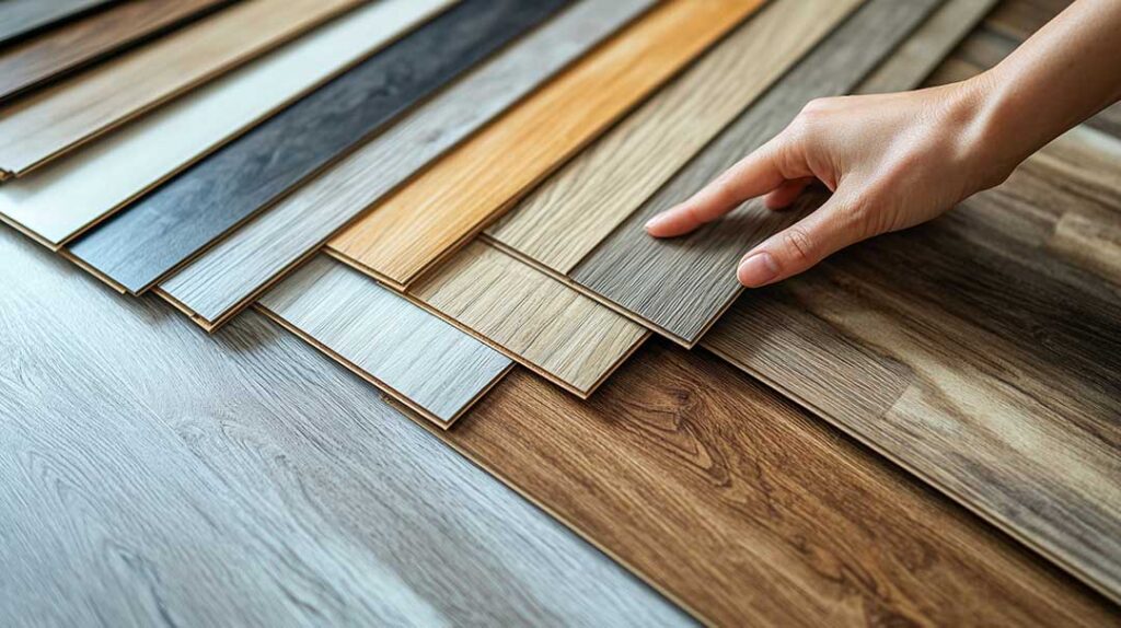
Choosing a floor color is less about finding a shade that looks attractive in a showroom and more about creating a balanced relationship between the flooring, walls, furniture, lighting, and daily routines. In Athens, OH, where homes may include older properties, apartments, updated ranch-style houses, and compact student-oriented spaces, the right color depends on both the room’s design and how the space is used.
How should flooring color relate to the rest of the room?
Flooring usually works best when it supports the room’s existing color palette rather than competing with it. A useful starting point is to identify the room’s three major visual elements:
- The wall color
- The largest furniture pieces
- The flooring
These elements do not need to match exactly. They need to share compatible undertones and a reasonable level of contrast.
For example, a room with pale walls and light furniture can become washed out if the floor is also extremely pale. A medium-toned floor may add enough definition to make the room feel finished. Conversely, dark furniture, deep wall colors, and dark flooring can make a smaller room feel enclosed unless balanced with lighter textiles, trim, or ceilings.
A simple guideline is to vary the lightness of at least two of these three major elements. If the walls, furniture, and floor are all nearly the same value, the space may lack visual structure.
What are undertones, and why do they matter?
Undertones are the subtle colors beneath the main appearance of a flooring material. A floor may look beige, gray, brown, or white at first glance, but it may also contain warm yellow, red, pink, blue, or green undertones.
Undertones become especially noticeable when flooring is placed next to paint, cabinetry, or furniture. A gray floor with a blue undertone may appear cool and crisp beside white walls, but it can look slightly purple next to warm beige paint. A brown floor with strong red undertones may clash with cabinets that have a yellow or green cast.
To compare undertones:
1. Place flooring samples beside the room’s trim, cabinets, wall color, and largest furniture pieces.
2. Look at the samples in morning, afternoon, and evening light.
3. Compare them against both bright white and warm off-white surfaces.
4. Avoid judging color under showroom lighting alone.
Flooring should be evaluated in the actual room whenever possible. Natural light changes throughout the day, while warm bulbs can make floors look more golden or reddish.
Should floors be lighter or darker than the walls?
Either choice can work. The better option depends on the room’s size, ceiling height, natural light, and visual style.
Lighter floors can make a room feel more open and can help reflect available light. They are often useful in smaller rooms, lower-level spaces, and areas with limited windows. Pale oak-like tones, soft beige, light greige, and muted natural shades can create an airy appearance without requiring all-white décor.
Darker floors provide contrast and can make light walls and furniture stand out. They may give a room a more grounded, traditional, or dramatic appearance. However, dark surfaces can show dust, pet hair, crumbs, and scratches more easily, especially where sunlight falls across the floor.
Medium flooring colors are often the most flexible. They offer enough contrast to define the room while generally being less visually demanding than very pale or very dark finishes.
How can flooring color make a room look larger?
Floor color can influence the perceived size of a room, although layout and lighting usually matter more.
To make a room appear more spacious:
- Choose a lighter or medium floor color.
- Use flooring with a consistent tone across connected rooms.
- Run flooring in the direction that supports the room’s longest visual line.
- Limit strong color changes between nearby spaces.
- Use low-contrast patterns rather than highly varied boards or tiles.
A continuous floor color can make separate areas feel more connected. This can be helpful in open layouts, narrow hallways, and smaller homes where frequent transitions may make the floor plan feel visually divided.
Large, bold patterns can be attractive, but they draw attention to the floor. In a compact room, a calmer color and pattern may create a more open impression.
How should flooring coordinate with wood cabinets and trim?
Wood flooring does not have to match wood cabinetry exactly. In fact, exact matching can sometimes make a room look overly uniform. The goal is to coordinate warmth, contrast, and scale.

If cabinets are honey-colored or reddish, a floor with a similar warmth may create a traditional appearance. A cooler or more neutral floor can provide contrast, but the difference should look intentional rather than accidental.
When both the cabinets and floor have strong grain patterns, the room may feel busy. In that situation, flooring with a quieter visual pattern can provide balance. If the cabinets are simple and understated, a more noticeable floor pattern may add interest without overwhelming the space.
Trim is another consideration. White trim is generally adaptable, while stained wood trim often needs closer attention to undertones. A floor that looks neutral beside white trim may appear noticeably warmer next to natural woodwork.
What flooring colors work well in homes with seasonal changes?
Athens has seasonal shifts in daylight, moisture, and outdoor conditions, so flooring color should be considered alongside entry habits and maintenance needs. During wet or muddy periods, very dark glossy floors may make tracked-in debris more visible. Extremely light floors can also show dirt, especially in entryways and kitchens.
Mid-range natural colors often provide a practical balance. Soft brown, muted tan, warm gray, and gently varied wood tones can help disguise small amounts of dust and everyday debris between cleanings.
Color does not determine durability, but it affects how quickly wear becomes noticeable. Highly uniform floors may show marks more clearly than floors with subtle variation. Gloss level also matters: a reflective finish can emphasize scratches and surface debris, while a lower-sheen finish tends to appear more forgiving.
Can flooring colors flow from room to room?
Connected rooms do not always need identical flooring, but their colors should relate. A consistent floor throughout adjacent areas creates the strongest sense of continuity. If different materials are necessary, choose colors with compatible undertones and similar visual weight.
For example, a warm wood-look floor next to a cool blue-gray tile may create an abrupt transition unless another element, such as paint or cabinetry, helps connect them. A neutral floor can serve as a bridge between rooms with different furniture and wall colors.
Transitions should also make practical sense. Kitchens, bathrooms, entry areas, and lower-level rooms may have different moisture or cleaning requirements. Design should support those functional needs rather than forcing every room to use the same material.
What is the best way to test a flooring color before choosing it?
Small samples can be misleading because flooring appears different across a larger surface. Use the largest sample available and place it in several parts of the room.
Check it:
- Near windows and in shaded areas
- Beside baseboards, cabinets, and furniture
- With existing rugs and curtains
- During both daylight and artificial light
- Against the room’s current wall color
Take photographs from different angles, but do not rely on a phone camera alone. Cameras may adjust brightness and color automatically. Personal observation in the room remains more reliable.
A flooring color that looks attractive by itself may not be the right choice once it is surrounded by the room’s permanent features. The most successful selection usually feels connected to the home’s existing materials, practical to maintain, and flexible enough to work with future decorating changes.